Special thanks to www.nhluniforms.com for their outstanding database
Before we announce the nominees, let us reflect on the namesake of this award, and give due deference to arguably the most ridiculous jersey design the world has ever seen:

Ahem.
And the nominees are:
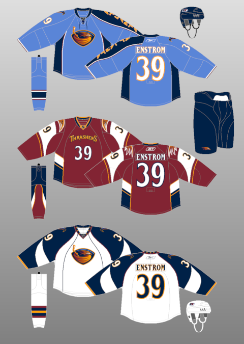
The Atlanta Thrashers Third Jersey

It's not just the sweater; it's the whole package. What are Atlanta's colors? Wikipedia lists them as Navy blue, Baby blue, Maroon, Burnt umber, Yellow, and White. The Red Wings colors are friggin red and white. ONE color aside from the obligatory away white. Atlanta seems to have an identity crisis. They used to have Navy Blue jerseys. Simple. Then they went to the light blue. Now they've introduced this maroon that used to be a trim color. Atlanta is a prime example that you really can overdo it when designing a team uniform. Their third jersey is just the latest in a long line of garish designs that flat-out suck.
For added ugliness, check out the socks that come with this POS.
The Toronto Maple Leafs Home Jersey
Who can resist getting their digs in on the supposedly richest team in the NHL when they can't even seem to spend money on brains?
If the Thrashers use too many colors, the Leafs use too little. Not too few, but too little. When the Leafs unveiled their new Reebok jerseys, everyone else seemed to notice what Leafs management overlooked: stripes. Basically, the Leafs were playing in practice jerseys.
The obvious question: who the hell forgot the stripes, and why is he still employed at MLSE?


Which is the game jersey?
The New York Islanders Away Jersey

Nassau Coliseum may be falling apart, but that hasn't stopped the circus from coming to town. What list of bad jerseys would be complete without the Islanders, who have made messing with a good thing into an art form. Perhaps it's the fact that it's too similar to the ill-conceived vest jerseys that some baseball teams wear. Maybe it's the fact that Rick DiPietro is wearing it, adding to the clown/circus vibe. Perhaps it's the ridiculous piping on the shoulders, an idea that, unfortunately, has been adopted by other NHL teams. Maybe it's the numbers on the right chest, an area normally reserved for Stanley Cup Finals patches (then again, there's no need for the Islanders to worry about that for the foreseeable future). It's the combination of all these factors that make the Islanders an inevitable addition to this list of nominees.
HM: LA Kings third jersey, Colorado Avalanche third jersey, Tampa Bay Lightning third jersey
With all that said, we also need to recognize some of the best jerseys in the league, if no other reason than to cheer us up after seeing those pieces of trash we just looked at.


2 comments:
geoff - I'm glad you included a look at some of the best jerseys in the NHL right now. I don't think its a coincidence that 3 of the 4 posted are original are Original 6 teams. They're all plain, simple, and stick with their franchise's roots. And the Minnesota Wild's 3rd jersey is arguably the best jersey in the NHl right now. It also fits the bill of what makes the 3 Original 6 team's jerseys posted so great (plain, simple, franchise roots).
The secret behind Atlanta's 3rd jersey is they're trying to lure an audience by tricking them into believing they're going to watch football.
Habs. Hawks. Sexy~~~!
Bolts. Nucks stupid whale one. Preds. Vomity.
Post a Comment